OMELIX
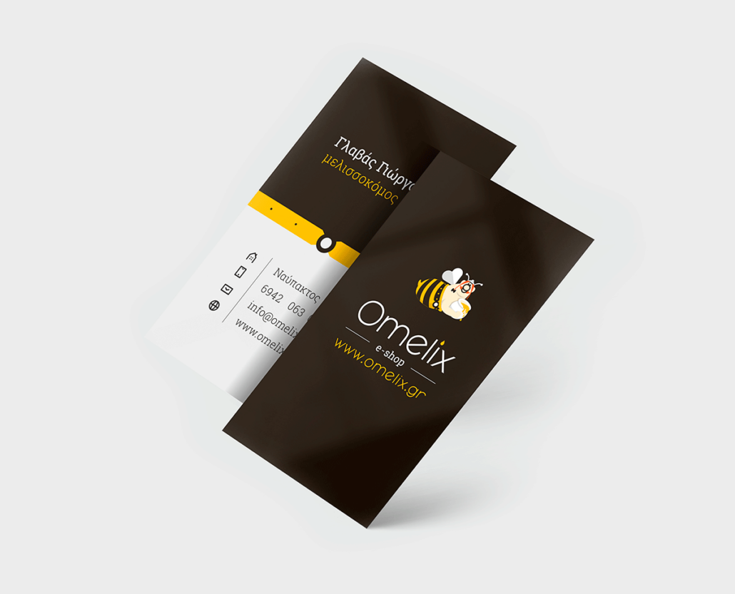
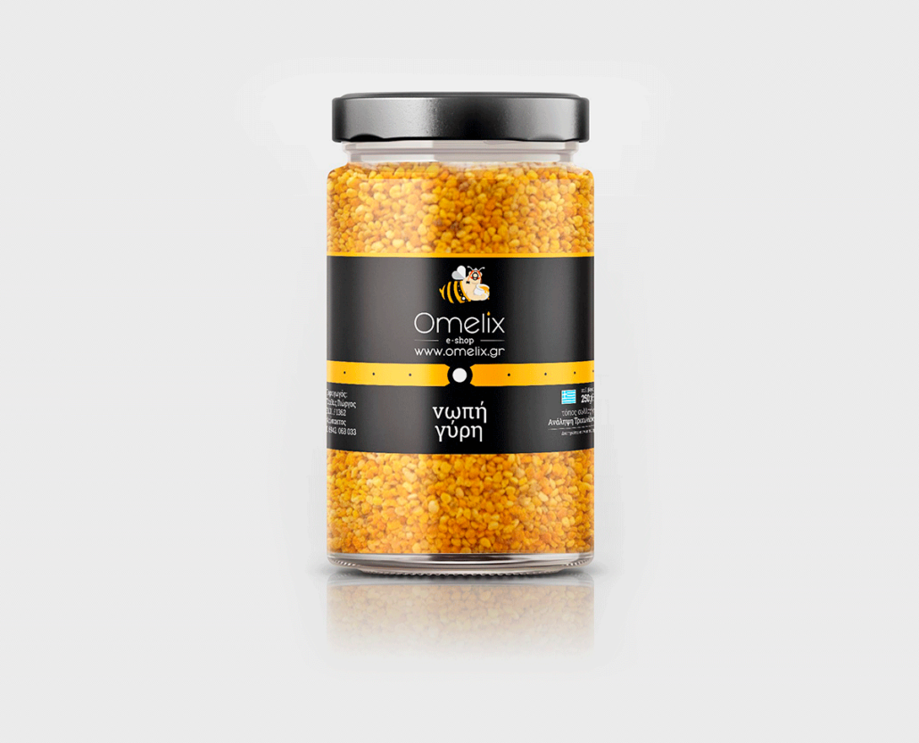
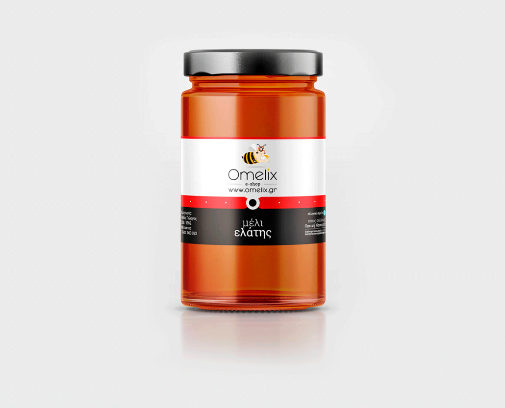
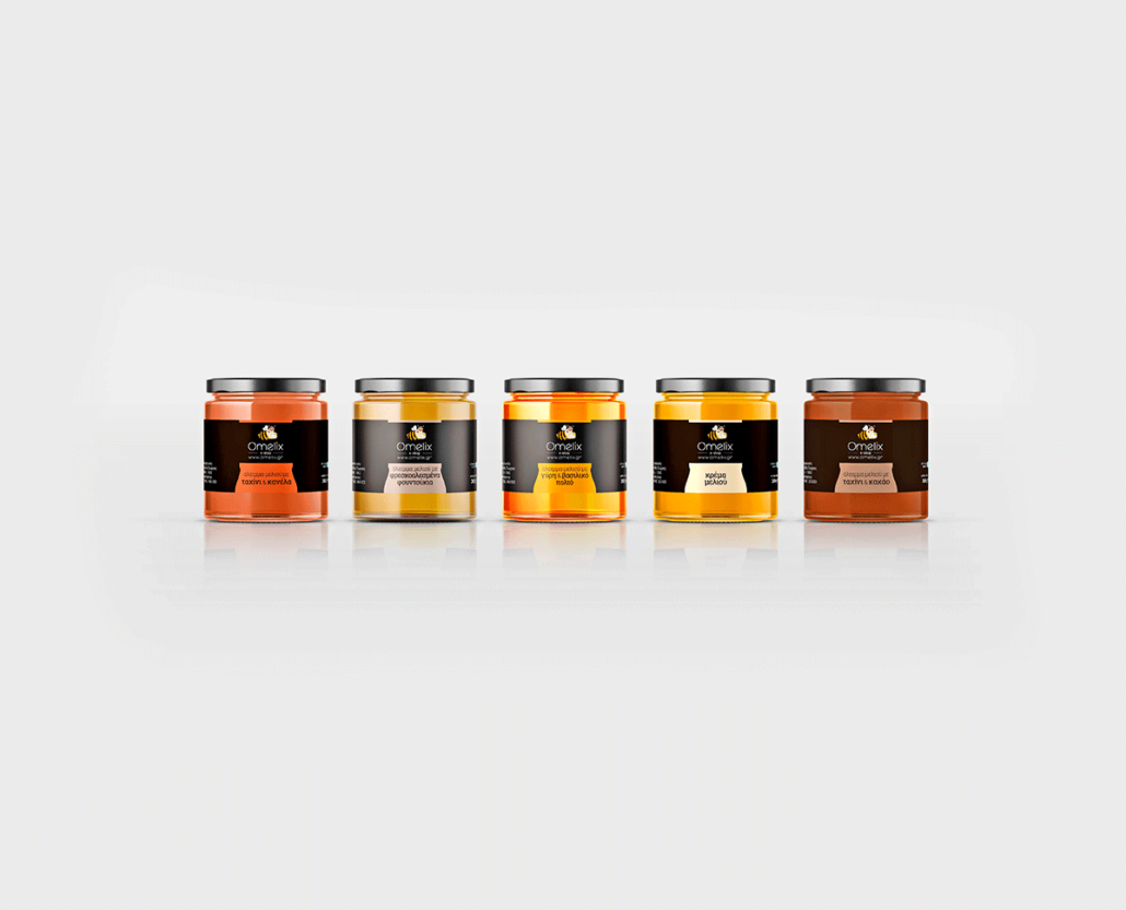
Logotype / corporate identity / packaging design for “Omelix”, a new founded apiary, based in Nafpaktos / Greece. An apiary (also known as a bee yard) is a location where beehives of honey bees are kept.
The concept / creative idea is associated to the name of the brand. “Meli” is the Greek word for “honey”. The trademark of “Omelix” is based on the figure of “Obelix”. So we connected the image of Obelix with a bee (=honey) vector image, creating a new symbol, “Omelix”. The final figure of Omelix, actually shows a flying bee, with the main characteristics of Obelix, carrying a jar with honey. The result of logotype & packaging was very unique, clean, as the client wished.
Client /
Services /
Year /
- Omelix Apiary
- Logotype, Corporate Identity, Packaging
- 2020

