NESTLE
Print Ads design for “Nestle”, a well known food company. The original Nestlé trademark was based on his family’s coat of arms, which featured a single bird sitting on a nest. This was a reference to the family name, which means ‘nest’ in German.
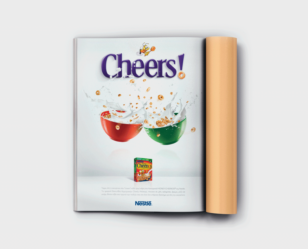
The concept / creative idea is associated to the name of nestle’s product, “Cheerios” cereals. We borrowed the word “Cheers” from Cheerios & designed an image of two cereal bowls, like clinking two glasses of wine. The final print ad design was very powerful, easy to remember.
Client /
Services /
Year /
- Nestle
- Print Ads
- 2010

