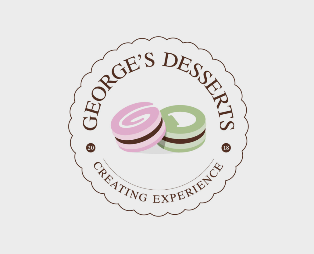
GEORGE’ S DESSERTS
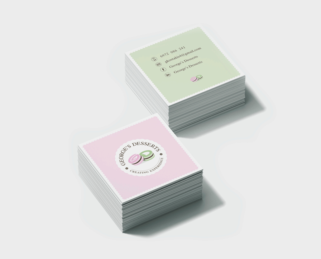
The client approached us to design the logotype / corporate identity for “George’s Desserts”, a home pastry chef. People need the comfort, joy & consistent quality that a clean home brings, he says.
The concept / creative idea is associated to the two initial letters of George’s Desserts, “G” / “D” & the icon of a macaroon, which is the special / favorite dessert of George. We designed two macaroons with different colors each, one for letter G & one for letter D. The final logotype is very unique, elegant, clean, representing the philosophy of the owner.
Client /
Services /
Year /
- George’s Desserts
- Logotype, Corporate Identity
- 2020

