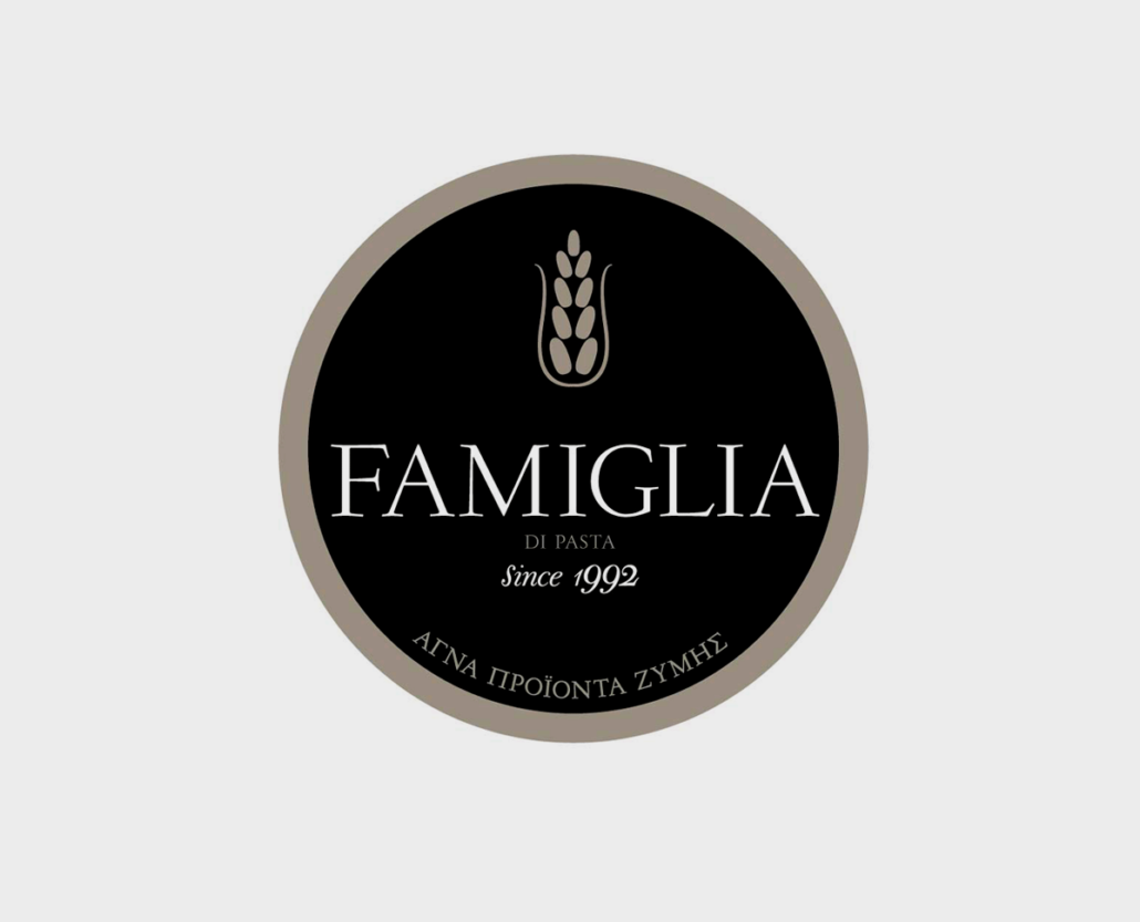
FAMIGLIA DI PASTA
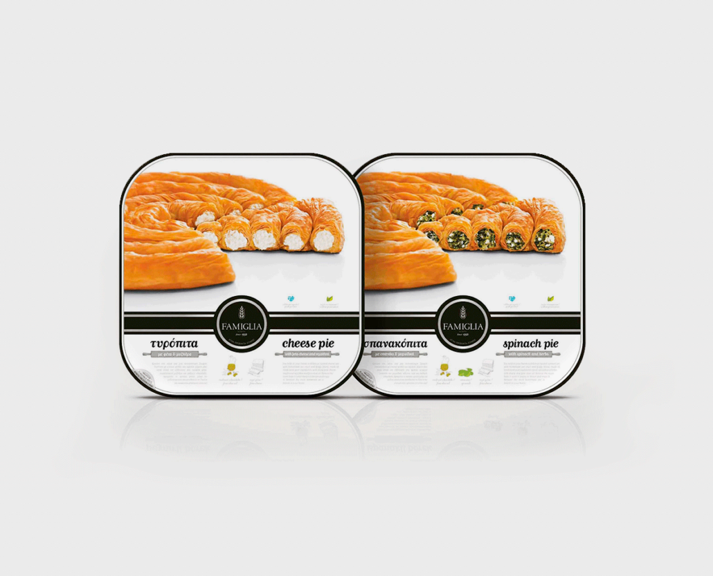
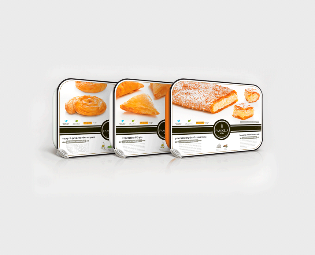
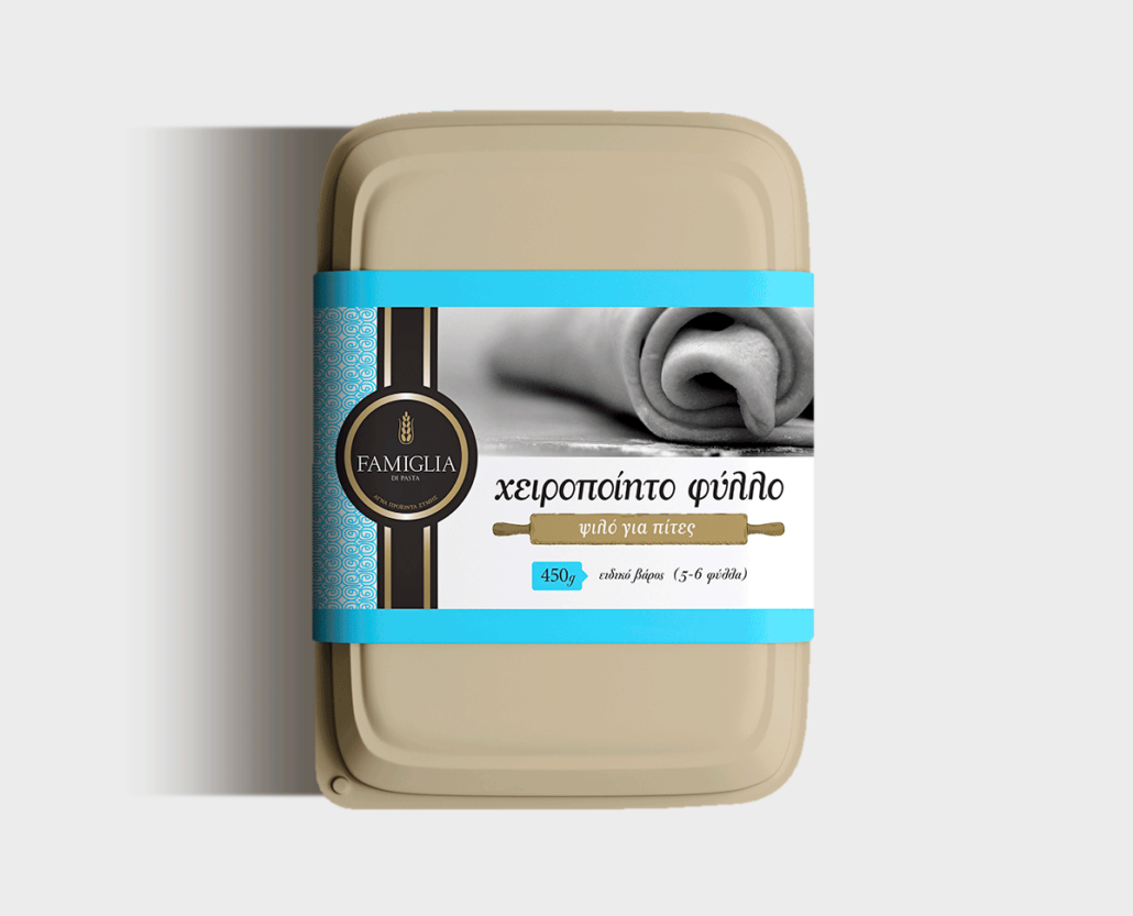
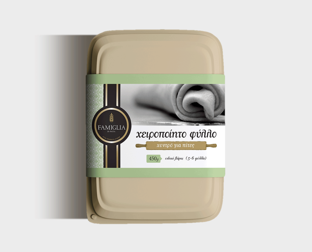
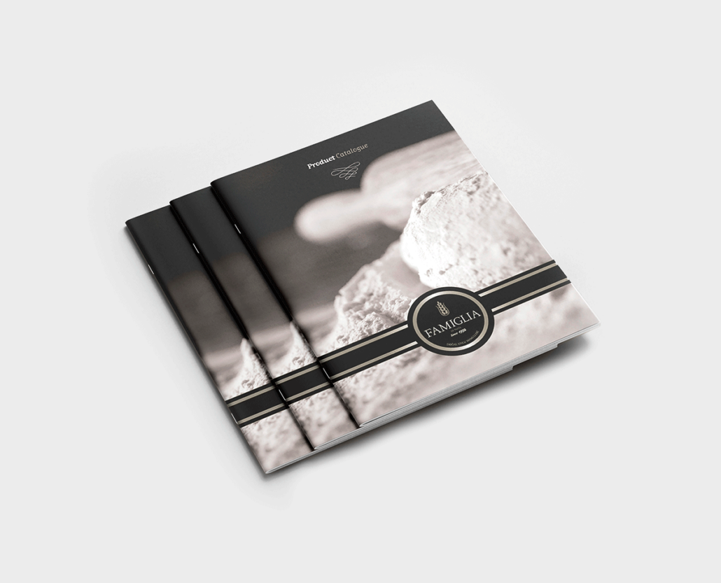
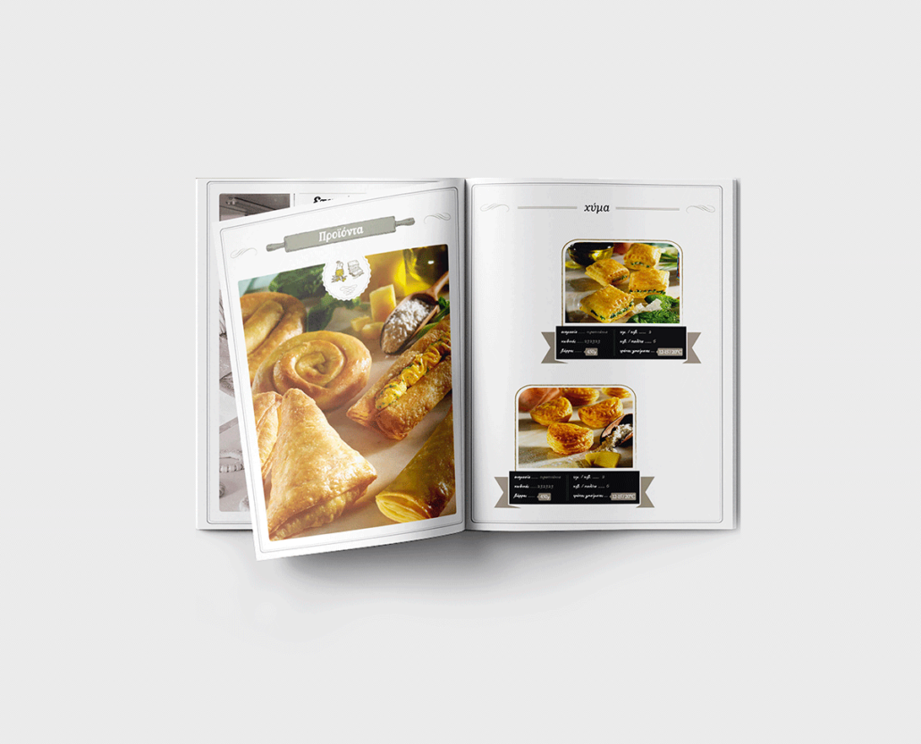
Logotype / packaging design for “Famiglia di pasta”, a new founded Greek Dough production company.
The concept / creative idea is associated to the fact that Famiglia produces a wide variety of Greek traditional products, using the finest ingredients based on traditional homemade recipes. We chose black & gold color, in order to show the quality, the authenticity & tradition of Famiglia. The simple symbol of wheat is the visual part of the logotype. We chose a sherif, classic font style to capture the timeless style of the company. The final logo & the packages are powerful, simple, traditional, easy to remember.
Client /
Services /
Year /
- Famiglia di Pasta
- Logotype, Packaging
- 2012

